Low-Visual-Noise Storage: Why Some Organizers Make Rooms Feel Calmer
Evidence ExplainerFTC disclosure: This article contains affiliate links. If you buy through Amazon links, ClutterScience may earn a commission at no extra cost to you.
AI authorship transparency: This draft was created with AI assistance and edited to follow ClutterScience evidence, disclosure, and product-link standards.
Some organizers make a room feel calmer immediately. Others technically hold the same amount of stuff but still look busy. The difference is often visual noise: the number of colors, edges, labels, logos, shapes, and exposed objects your eyes have to process.
Low-visual-noise storage is not the same as minimalism. A family can own plenty of things and still reduce visual noise by choosing calmer containers, grouping categories, and hiding low-use inventory while keeping daily-use items accessible.
Search for matching storage bins with lids, fabric cube storage bins, or closed storage cabinet for living room. These are Amazon search links, not direct ASIN links, because no live ASIN verification was performed during drafting.
What Visual Noise Means
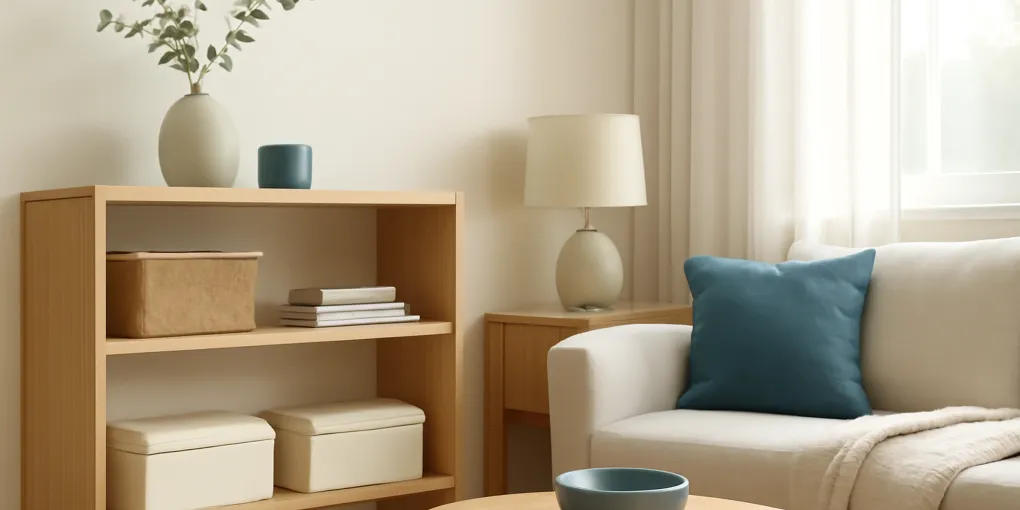
Visual noise is the unnecessary information a space asks you to process. A shelf of mismatched bottles, bright packaging, tangled cords, half-visible toys, and random paper creates more visual information than a shelf of matching bins with clear categories.
The issue is not moral. Busy shelves do not mean a household is failing. They mean the storage is exposing too many details at once. Human attention is limited, and research on visual attention shows that irrelevant stimuli can compete with task focus.
In a kitchen, visual noise may come from packaging. In a bedroom, it may come from clothing edges and open baskets. In a living room, it may come from toys, remotes, chargers, books, and hobby supplies sharing one surface.
Why Containers Sometimes Make It Worse
Buying more containers can increase visual noise when each container has a different color, texture, label style, and shape. A row of mismatched bins may be more organized than the original pile, but it still asks the eye to parse many separate objects.
The most common mistake is choosing containers one at a time. Each purchase solves a local problem but ignores the whole room. Over time, the home collects ten kinds of baskets, three kinds of labels, and a dozen clear bins with visible mixed contents.
Low-visual-noise storage works from the room backward. Ask what the room should feel like, which categories need visibility, and which categories can be visually quiet.
Open Storage vs Closed Storage
Closed storage usually reduces visual noise because doors, drawers, and lids hide item-level detail. But closed storage can fail if it hides items you need daily. When things disappear, people stop using the system or buy duplicates.
Open storage is better for daily routines, kids’ independence, and items that need cues. A child may return toys more reliably to open bins than to lidded boxes. An adult with a fast morning routine may use an open tray for keys and glasses more reliably than a closed drawer.
Use this rule:
| Item type | Better storage | Reason |
|---|---|---|
| Daily use | Open or shallow | Reduces access friction |
| Weekly use | Labeled bin or drawer | Balances access and calm |
| Seasonal use | Closed opaque bin | Reduces exposed inventory |
| Visual-heavy packaging | Decanted or closed | Lowers color and logo noise |
| Shared household tools | Visible label | Reduces search time |
The goal is not to hide everything. The goal is to expose only the information that helps behavior.
The Three Levers of Calmer Storage
There are three main levers: color, repetition, and boundaries.
Color matters because packaging is designed to compete for attention. Removing packaging or placing items in neutral bins can calm a shelf quickly. Repetition matters because matching shapes are easier to scan than random shapes. Boundaries matter because a defined container tells the eye where a category begins and ends.
You do not need expensive custom storage to use these levers. A row of identical shoebox-size bins can outperform a mix of decorative baskets if the categories are clear and the sizes fit the shelf.
When Clear Bins Are Best
Clear bins are useful when visibility prevents duplication or forgotten inventory. They work well in pantries, craft supplies, medicine overflow, hardware, and seasonal decor categories where contents are not visually chaotic or are stored behind a door.
Clear bins are less calming in open living spaces. A clear bin of mixed chargers, toys, or toiletries still displays every cable and color. In visible rooms, opaque or fabric bins often work better.
If you use clear bins in visible areas, keep contents category-specific and add simple labels. Do not let clear bins become transparent junk drawers.
When Matching Bins Help
Matching bins help when the room has many small categories. They reduce shape and color variation, which makes shelves feel calmer. They also create a capacity limit. If the games bin is full, the category needs editing before another purchase.
The risk is over-uniformity. If every bin looks identical and labels are hard to read, users open multiple bins to find one item. That increases friction. Use large plain labels, consistent placement, and category names that match household language.
Search for label clips for storage bins or large bin labels if labels are the missing piece.
Evidence Notes
Studies of visual clutter and attention suggest that irrelevant visual stimuli can slow search and compete for attention. Visual-science research has operationalized clutter as feature congestion and has found that clutter can affect target detection performance. Workplace and classroom research also points to the importance of environmental complexity, although home environments vary widely. The practical takeaway is modest: reduce unnecessary visual competition in spaces where you rest, focus, cook, or make decisions.
There is also a behavior-design tradeoff. If a system is too hidden, people may not maintain it. If it is too visible, it may add cognitive load. Good organizing chooses the least noisy system that people will still use.
Sources
- Rosenholtz et al., “Measuring visual clutter” (PubMed) — supports the article’s explanation that visual clutter can be described by measurable feature congestion rather than taste alone.
- Bravo and Farid, “Regional effects of clutter on human target detection performance” (PubMed) — supports the claim that clutter can make visual search and target detection harder.
How We Scored the Recommendation
ClutterScience uses a G6-style composite score so a tidy photograph does not outrank a system that actually survives daily use. The weighting is 30/25/20/15/10: research fit 30%, evidence quality 25%, value 20%, user signals 15%, and transparency 10%.
Research fit asks whether the tool reduces the specific clutter mechanism: delayed decisions, hidden inventory, excessive search time, or visual competition. Evidence quality asks whether the recommendation matches findings from environmental psychology, human factors, and household safety guidance rather than personal taste alone. Value asks whether the product adds capacity or reduces friction without creating another maintenance chore. User signals include common failure modes reported in reviews and the kind of household the product appears to fit. Transparency means we explain when we are using Amazon search links rather than claiming a verified ASIN.
A Room-by-Room Strategy
In the living room, hide low-use categories and keep daily items in one attractive tray or basket. Remote controls, chargers, and current books can stay visible if they have boundaries.
In the kitchen, reduce packaging noise where possible. Group snacks, baking supplies, and supplements into bins or zones. Keep labels simple. Do not decant everything if it creates extra work or loses safety information.
In bedrooms, prioritize closed clothing storage and calm bedside surfaces. A single tray can hold glasses, lip balm, and a charger. Avoid turning the nightstand into a mini warehouse.
In kids’ spaces, use open bins for active toys and closed bins for rotation. Matching bins can help adults feel calmer, but children need categories they can understand.
Buying Checklist
Before buying storage for a visible room, ask:
- Will this reduce exposed colors and shapes?
- Is the category clear enough for a label?
- Can users access it with one motion?
- Does the container fit the shelf with breathing room?
- Will matching several of these make the room calmer?
- Is the material easy to clean for the location?
Avoid buying a single beautiful basket for an undefined category. Undefined categories become clutter with handles.
The Label Paradox
Labels reduce search time, but too many labels can add visual noise. The solution is label hierarchy. Use visible labels for shared categories that multiple people need to find. Use smaller or hidden labels for private categories that one person manages. A pantry bin labeled “lunch snacks” may need a large label. A bedroom bin of seasonal scarves may not.
Label style matters too. Mixed fonts, bright label tape, and handwritten notes in several colors can make a shelf feel busier. A simple label system with consistent placement often looks calmer than a more elaborate system. The label should answer the retrieval question, not advertise the organizer.
For children or visual thinkers, picture labels can be useful. Keep them simple and consistent. A small icon plus one word is usually enough. The goal is independent use, not a perfect catalog.
Texture, Shape, and Shadow
Visual noise is not only color. Texture and shape matter. A shelf with wire baskets, woven baskets, clear bins, cardboard boxes, and fabric cubes has many edges and shadows. Even if each container is useful, the mixed materials can make the room feel busy.
Choose one dominant material per visible zone. Fabric cubes can calm a cube shelf. Sealed wood boxes can warm an entry. White or clear bins can simplify a closet. Mixing materials is fine when intentional, but random accumulation reads as clutter.
Shadow lines matter in open shelving. Bins that fit with a little breathing room look calmer than bins jammed edge to edge. If a container must be pulled out daily, leave finger space. A system that looks seamless but is hard to use will fail.
How to Audit One Shelf
Choose one shelf or surface and take a phone photo. Photos flatten the room and make visual noise easier to notice. Look for repeated colors, exposed packaging, tangled cords, and categories without boundaries.
Then remove everything and group by category. Put back only the categories that belong in that room. Choose one container style for the visible items. Hide or relocate backup inventory. Add labels only where someone else would need help finding or returning the item.
After one week, check whether the system still looks calm and whether people used it. If the shelf is calm but nobody returns items, access is too hard. If people use it but it looks busy, reduce exposed detail with more consistent containers or closed storage.
Bottom Line
Low-visual-noise storage works because it reduces unnecessary information while preserving useful cues. Closed storage, matching bins, neutral colors, and simple labels can make a room feel calmer, but only when they match real behavior.
Start with the most visually busy shelf or surface. Remove packaging, group categories, choose fewer container styles, and keep daily-use items easy to reach. Calm storage is not about owning less than everyone else. It is about making the room easier to read.
Frequently Asked Questions
- It is storage that reduces competing colors, shapes, labels, and exposed objects so the room is easier to visually process.
- No. Closed storage is calmer visually, but open storage can be better for frequently used items that need cues. The best choice depends on behavior and visibility needs.
- Matching bins can reduce visual complexity, but they help only if categories are clear and the bins are easy to maintain.